Menu
Exploring three music academy websites to understand how typography, imagery, video, and design shape user experience and engagement.

A well-designed music school website can make a strong impression and influence whether someone reaches out or moves on. In this article, I’m reviewing the websites of three music schools to see how effectively they communicate credibility, professionalism, and personality.
These three local schools - Vienna Academy of Music and Arts, Notes n’ Beats, and Prince William Music Academy - teach foundations in musical education and performance. But beyond their music, we’re going to dive into different aspects of their websites to see what we can learn, from strong design choices and smart use of media to missed opportunities in layout and messaging.
When you’re creating a music school website and you think of the emotions you want to convey to those who visit your homepage, words that might come to mind are:
One of the key components that shapes how your music school’s brand is perceived is the font choice. There are fonts that are considered neutral - think default fonts on your Android or Apple device. And then there are fonts that have more personality and can subconsciously affect a visitor’s feelings.
That’s where I think Vienna Academy of Music and Arts does a good job of exploring.

For each section label, they chose a cursive font that I imagine looks like a kid’s handwriting. It’s not the easiest to read, but it immediately adds a human element and softness which is reflective of a music school where you want kids to have the freedom to explore their creativity. It didn’t need to say any of that, but in some way or another, you can feel that through the cursive font.
Rather than using just one font, they strategically pair two fonts together and use a playful yet elegant serif font for the headings. A serif font is a typeface that has small decorative strokes or extensions, called serifs, at the ends of the letters. A popular serif font you’ve probably seen and used before is Times New Roman, which was the default font on Microsoft Word for over a decade. These fonts typically give off a classic, timeless, and elegant feel.
You can see how using this heading font also reinforces that playfulness but also lifts it up simultaneously and gives off a bit of classiness and elegance. By pairing these two fonts together, it’s adding that personality that goes beyond what a neutral font provides. It’s important to not overdue it, as you can probably see that having the entire site in that cursive or heading font would be too much. It’s good practice to use a neutral font for the body text as they do here.
Potential customers always want to know who you’ve worked with, what past clients have had to say about your work, and the levels of success they can expect to achieve with your product or service. One of the best ways to exhibit social proof and establish credibility is through showcasing recognizable logos.

Many of their students have earned acceptance to the nation’s most prestigious universities and conservatories. Displaying those logos inspires hope for prospective students that they might also achieve this level of success by enrolling at Vienna Academy of Music and Arts.
This is the equivalent to name-dropping, and even if you don’t recognize all of these schools, there are enough big name and local universities that most visitors will recognize.
I love the background video that Notes n’ Beats uses in the header section of the homepage. It shows a dynamic musical production with various musicians, dancers, and singers.
Videos can be powerful but only when they’re integrated thoughtfully into the design. The way this video is currently embedded could be improved so that it doesn’t unintentionally draw attention away from the message.
If you hover over the section, you can see the YouTube branding, the Watch Later/Share/Info bar, and the name of the YouTube video.
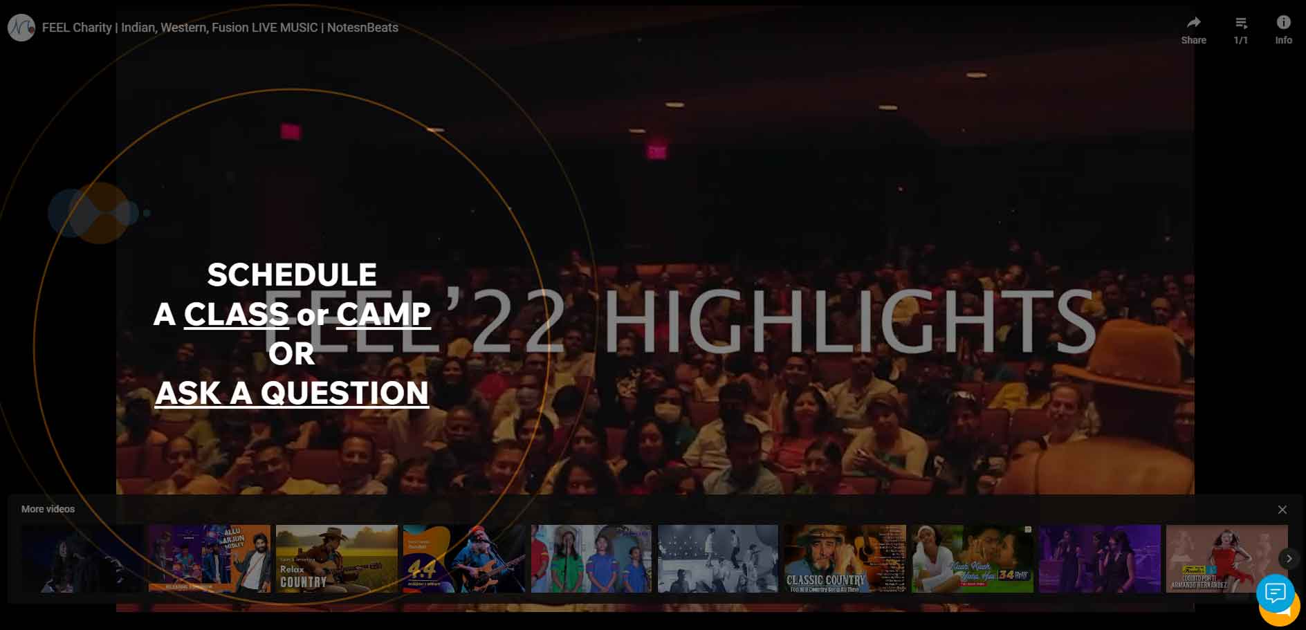
You can also see a More Videos bar. This is another unwanted element that’s obscuring more of the video and distracting visitors from what they originally came to your site to see. A cluttered embed with YouTube branding and unrelated recommendations can cheapen the experience and confuse visitors.
The main Call to Action section - “Schedule a class or camp or ask a question” - can also be better distinguished from the video. It’s not abundantly obvious that it’s separate from the video or that the heading contains links that you can click on. A better standard practice would be to use buttons which clearly indicate intent.
Further down, you see another YouTube video embedded on the page, and this one appears to be floating in the section.

But just below that, they do have an example of nicely embedded videos.

As you can see, it’s a huge benefit that they have so much great video content at their disposal, but placing the videos more mindfully into the layout would help avoid them feeling intrusive or out of place.
Repeating motifs are visual elements like shapes, colors, icons, or patterns that show up consistently throughout a website. Motifs create a sense of cohesion and help reinforce the brand’s identity. There are a few motifs that Notes n’ Beats uses that tie the website together nicely.
Motif #1: The logo is used throughout the homepage as a decorative element.
Motif #2: They use these orange concentric circles as frames for images and important text.

Motif #3: This scrolling effect where sections appear to stack on top of each other.
Each of these motifs may not garner much individual attention, but when done well, these small details make the site feel more intentional and polished, guiding the user through the content in a visually unified way.
The homepage for Prince William Music Academy is clean and straightforward. I especially like how they incorporated the background video in the header section.
The close-up footage of students playing various instruments offers a personal, behind-the-scenes glimpse into life at the academy. This is an example of a video that’s well-integrated and adds to the site’s professional feel.
Below the header section, they provide three benefits to enrolling your child in the academy.

The image of the puzzle pieces loosely connects with the idea of learning, especially in the realm of music education. Similarly, the GRIT acronym is positive and inspiring, but it doesn’t feel directly tied to music or the concept of perseverance in a musical context. Using generic stock images that don’t align with the headings or appear to be filler results in a missed opportunity to strengthen the message.
Here are some alternative photo ideas that could better support the message:
The homepage is straightforward and to the point, but there’s little for visitors to explore.
Aside from the main menu and footer, there’s only one call-to-action button - Schedule a Trial Lesson. It’s great that it’s included, but the homepage could benefit from pulling in highlights from other pages to make it more engaging and informative.

Scheduling a Trial Lesson is likely the main action they want visitors to take, so positioning this button at the top of the homepage will likely boost engagement. Additionally, each section could benefit from linking to relevant pages:
Visitors already know this is a music academy, so the homepage should serve as a compelling sales pitch. It’s the perfect place to showcase your unique offerings and motivate them to schedule a trial lesson. Rather than relying on generic stock photos and vague text, the homepage should be an engaging experience that drives action, whether that’s exploring more on other pages or making good on the main call-to-action.
Building a great music school website is about creating an experience that draws people in and gets them excited to take the next step, whether that’s booking a trial lesson or exploring your offerings. Every detail counts, from picking the right fonts and images to embedding videos thoughtfully and reinforcing your message with small but powerful design choices. When you get it right, your website can become a key part of turning visitors into dedicated students.
If you're a business owner looking to refine your website this year, please fill out the contact form and mention that you'd like a website review in the project description. I'll personally evaluate your site and provide a consultation with tailored feedback and a plan of action.


